Mmm… Yes. A blog about why Vivaldi is the best, on a Vivaldi blogs site! Really nice!
Yes! Vivaldi is the best browser AND company. I mean, You’re reading this blog made on Vivaldi blogs. But why is it the best? (You might know)
Chapter 1: Themes
Oh ho ho! Vivaldi has themes that you can make (check my published themes here) yourself or you can download other themes made by the community! The things there are just wow: you can put images, change the browser’s colours, have DIFFERENT ICONS, have transparent tab bar or make its colour change based on the site your in, make other parts transparent and even blurred. Yea. That is insane.
Chapter 2A: Customize Toolbar menu
You can change the order, add / remove buttons from your address bar, sidebar, status bar, EMAIL BAR when normal AND Composing…
Chapter 2B: Sidebar and Status bar
This thing has a sidebar that lets you have the bookmark menu, the reading list, the downloads etc. YOU CAN HAVE YOUR OWN TRANSLATE MENU EVERYWHERE AND YOU CAN WRITE NOTES AAAAAAAAAAAAAAAAAAAAAAAAAAAAAAAAAAAAAA
Sessions are basically saves of your browser. Were you looking at vacation trip ideas and where to check in, but now you want to continue watching Instagram reels? Well you can just save your trip stuff and go on.. I never used it but it’s pretty cool.
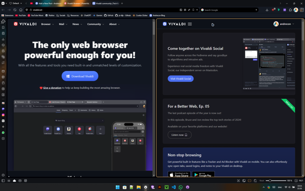
Oh and you can have websites open like a panel in the sidebar just like that. I can’t explain you will have to do it yourself. So go download Vivaldi NOW (or else…)
Status bar has the Break mode which…. Wait I took a break. Where was I? Oh yea. It disables everything and just puts you on a break. You can still see the layout of your browser but nothing else.
This is how it looks
You also have the “This is where this text will take you” thingy where you hover on a link and it shows it below all content, usually in a corner. And you have page actions, which let you change how the page behaves, like making it sepia, 3D, highlight hover etc. You also have image tiling, which lets you have two websites side-by-side for multi-tasking.
Page tiling
Chapter 3: MAIL
THIS THING HAS MAIL, CALENDAR, TASKS?! AND A RSS READER (rss is basically feeds.) oh AND THERE ARE CONTACTS AAAAAAAAAAAAAAAAAAAAAAAAAAAAAAAAAAAAAAAAAAA.
yey.
Chapter 4: More customization
In Vivaldi there is a feature called command chains. These let you run multiple actions, through a single click, or type with quick commands.
Bonus: with quick commands you can type anything, like calculations, open nicknamed bookmarks instantly and run quick commands and menu items too.
Oh. You can customize the Vivaldi BUTTON MENU (the menu where the Vivaldi button is or when you press Alt). You can add, remove and reorder items in any menu you like, whether it is the Vivaldi button menu, right-click on tabs/images/links/etc.
There is way too many things I could talk about but that’s the problem. There are way too many features and I like it this way!
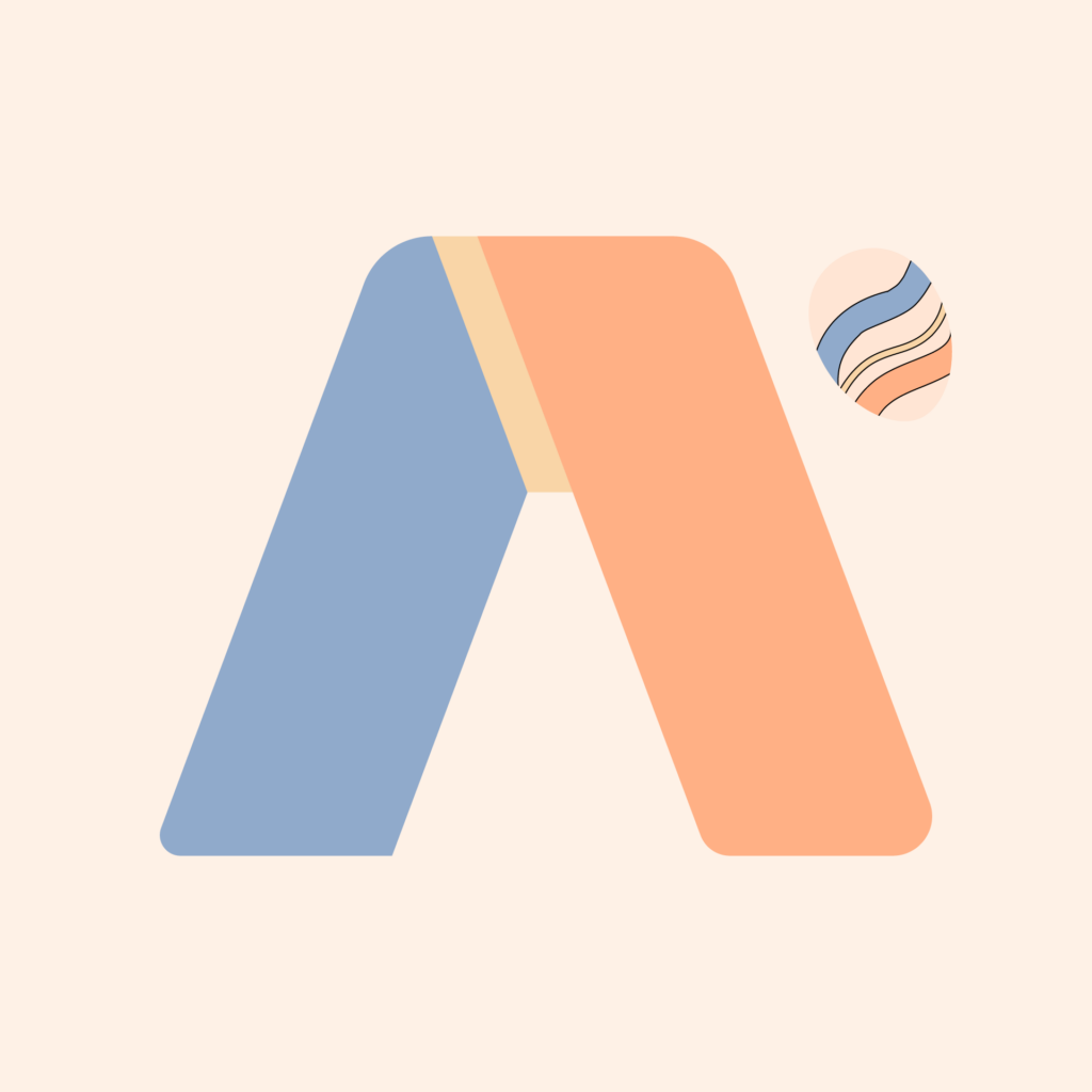
You know how my logo looks like now, right? It’s this right here. I know, it’s very beautiful!
The most recent logo
But my first logos weren’t always like this. For a fact I actually used Blue and Redinstead of Blue and Orange. Let’s go over through all of my logos way back from 2018 (I think)
DIY Era
This was my first ever logo, back when I was little. I used to do kind of DIY stuff. Ik, a bit weird but it is a start. And before y’all go crazy, that’s a pair of scissors (What were you thinking about? 🤨)
As you can see this looks awful, and it is not even centered…
Blue & Red Era + Star Wars Font (yikes 😬)
We are getting into the territory where I made very bad logos with bad colour choices
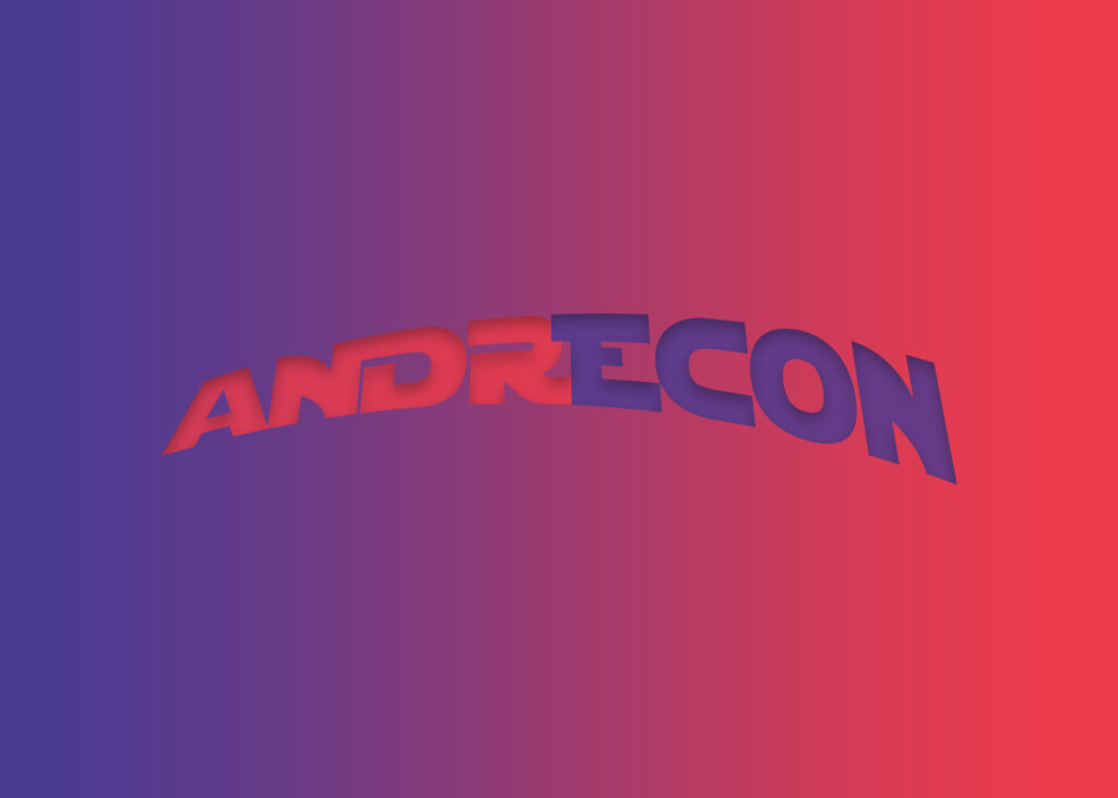
Andrecon 1
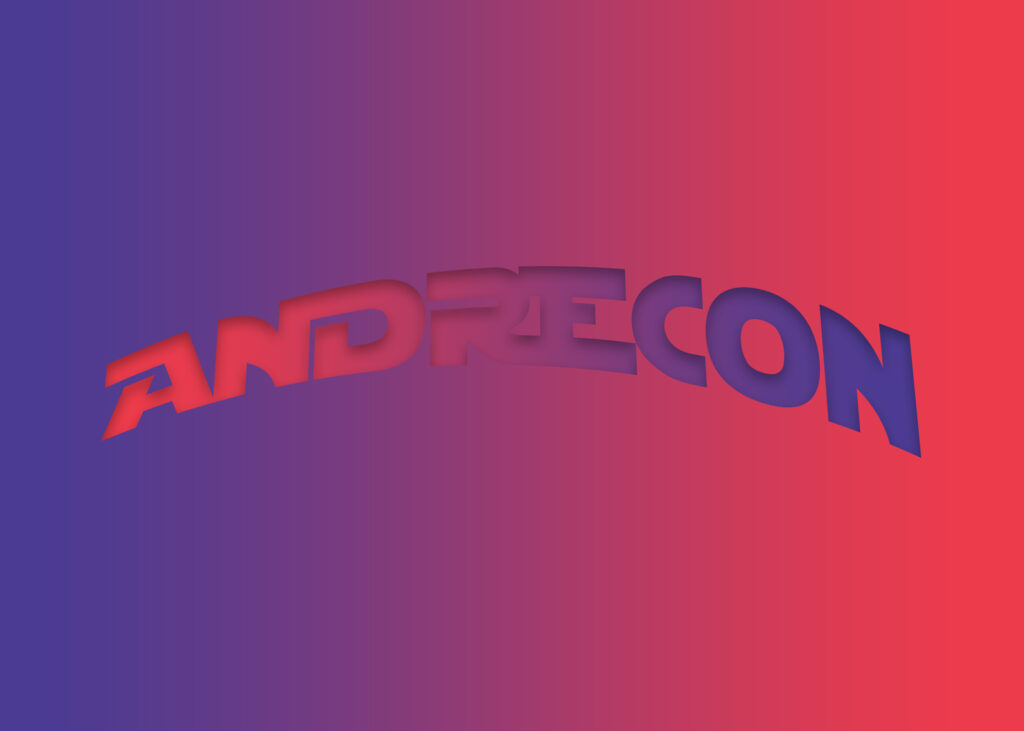
Andrecon 2
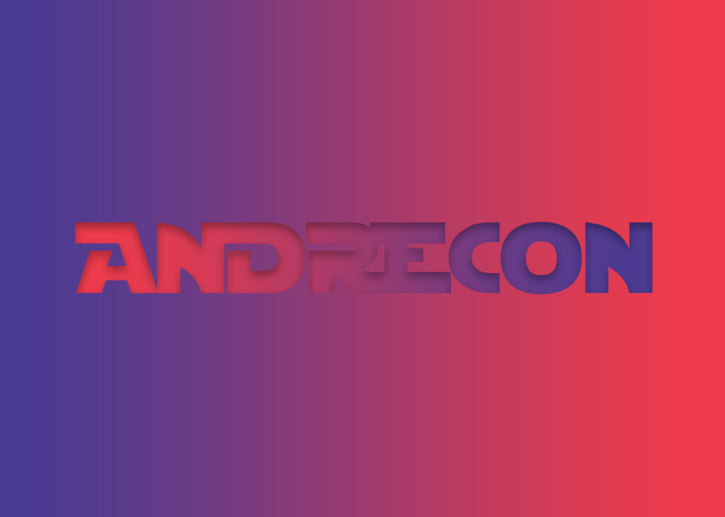
Andrecon 3
These three (called Andrecon 1, 2 and 3) are the first logos of my Blue and Red Collection. Personally, I think Andrecon 1 is better in terms of colours, while 3 is better by being flat and has better looking letters. 2 is just an in-between…
Next are Andrecon 4 and 5 which are a little different from the first three.
Andrecon 4 (Wingdings say “4th edition”)
Andrecon 5
Andrecon 4 has a stranger look than the others by ditching the Star Wars font. Oh. And the Wingdings say “4th edition”. Andrecon 5 had this band look, idk why, and it has a logo for Andr2con (basically me but alt accounts) which had everything the same except the 2 was outlined and not filled, and there is a more visible white glow around the image.
The “I lost creativity” era
This era I made a ton of logos that either didn’t fit my vibe, either they were crazy-looking.
@Andrecon6G Colors
@Andrecon6G (2) (Didn’t really have a name)
So they are called “@Andrecon6G Colors” and @Andrecon6G (2)” (Didn’t really have a name) respectively. As you can see these don’t have the same vibe (the second looks kinda cool ngl) and the first one was way too crazy…
> Note: I remember having a “Andrecon @_@” logo (@_@ meaning nauseated eyes, spiraling around) but I think it is just Colors… idk
The “New” Era
I started making better logos, getting better and better at it. The reason why New is in quotes is because there is another era.
Andrecon Icon
This logo was the main from the AC Icon pack, being the most used, being in every account I had.
Andrecode Icon
This logo was specifically made for coding accounts, such as GitHub.
Andrecon Gaming Icon (never used)
Never used, it was supposed to be for my dreams of having a YouTube (and many like MrBeast). It looks gay.
Apart from these, there were 3 more logos, which are cool, but not the best.
Simple Andrecon (formerly New Andrecon)
This was my logo for most of my social media, such as Instagram and Twitter (I still refuse calling it X). It was used in my Minecraft skin too. (Inspired by the original CGCristi logo (don’t ask why he is trans, that is just online) )
Andrēcon Logo (this is just the logo, there was some text too)
I just got bored and never used it, but looks nice
Andrecon Orange (2023 version)
This was the first version of my current logo, being made in 2023 and looking like the Alchemax logo (from this link) from Spider-Man. It was accidental and realized after I made the current logo.
The Orange Era
We are finally here, at the most recent logo! “Andrecon Orange (Designs) 2024” (or just Andrecon Orange, that was the folder name). This logo has the most variants out of all. It has with text and without, round and square image, Gradient, Easter, Christmas, Halloween and Glow. + Designs logos (has a brush added)
Regular
This is the first variant made, and the OG
Gradient
This is the second variant, being a refresh to the OG
Glow
This is the third variant, being based on my wallpapers (only for me srry)
Easter
The Easter Variant, being made for Easter ofc. It has pastel colours and an egg falling
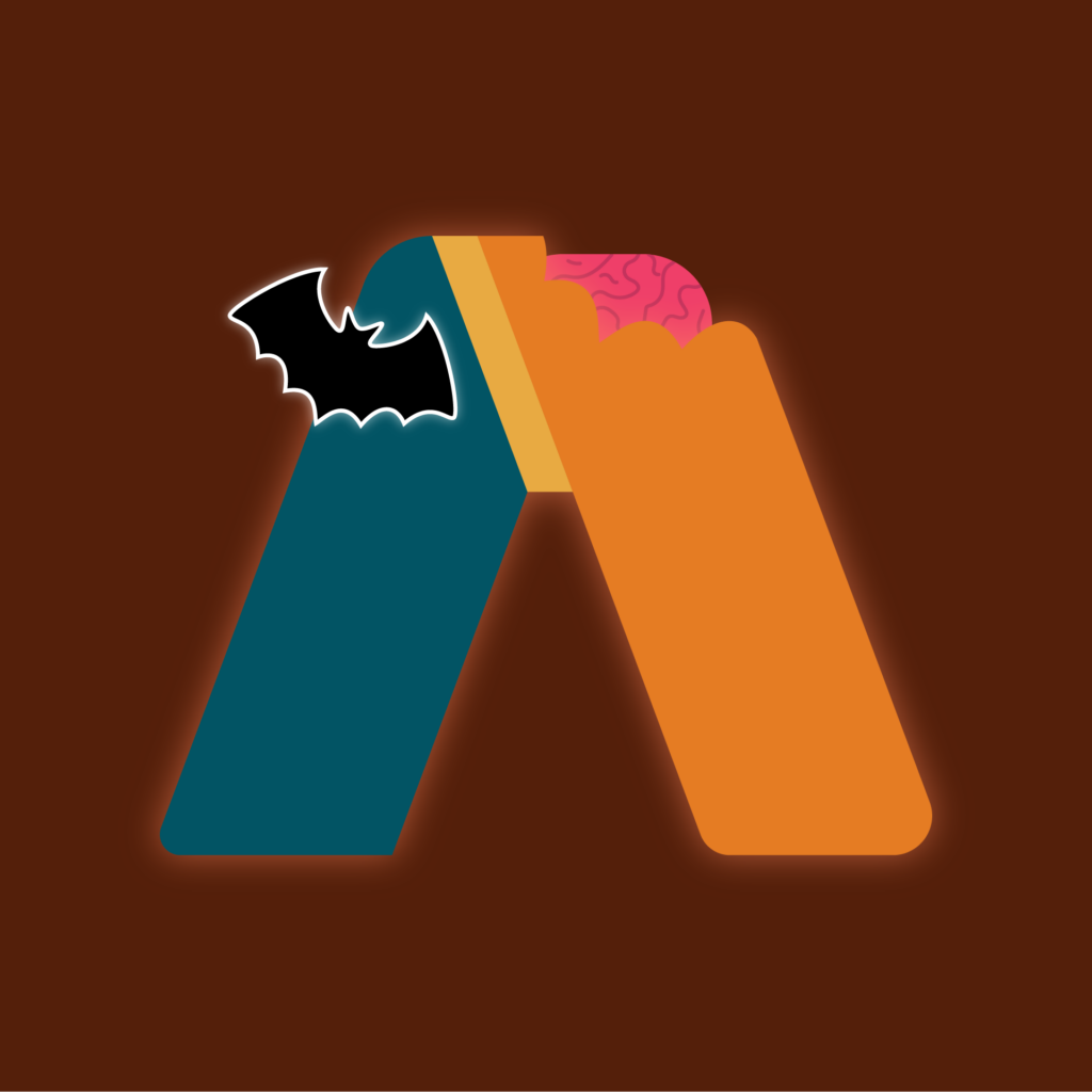
Spooky Season (Halloween)
The Spooky Variant, being made for Halloween ofc. It has a showing brain which makes no sense, and a bat
Christmas
The Christmas Variant, being made for X-Mas ofc. It has the logo wearing a Santa hat and snowflakes falling in the background
Logos that I actually used + some others that I didn’t showcase
From this list I used most logos but I have some that I only used on Discord (i left) and didn’t really fit the eras. So the logos I used, and are listed above, are:
Andrecon 1, 2, 4 and 5
Both from I lost creativity era (somehow)
AC Icon
Simple Andrecon
Andrecon Orange 2023 (+ 2 seasonal that I didn’t show)
Andrecon Orange 2024 (All variants except Glow)
Now there were 3 logos I Specifically used on Discord. These were:
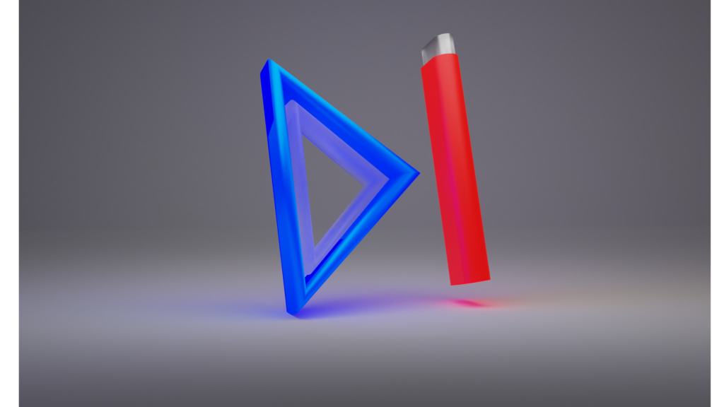
SkipCon
This was an attempt on making stuff in blender. Looks cool, I might reuse it (nah not really). I used this in Discord for the first time
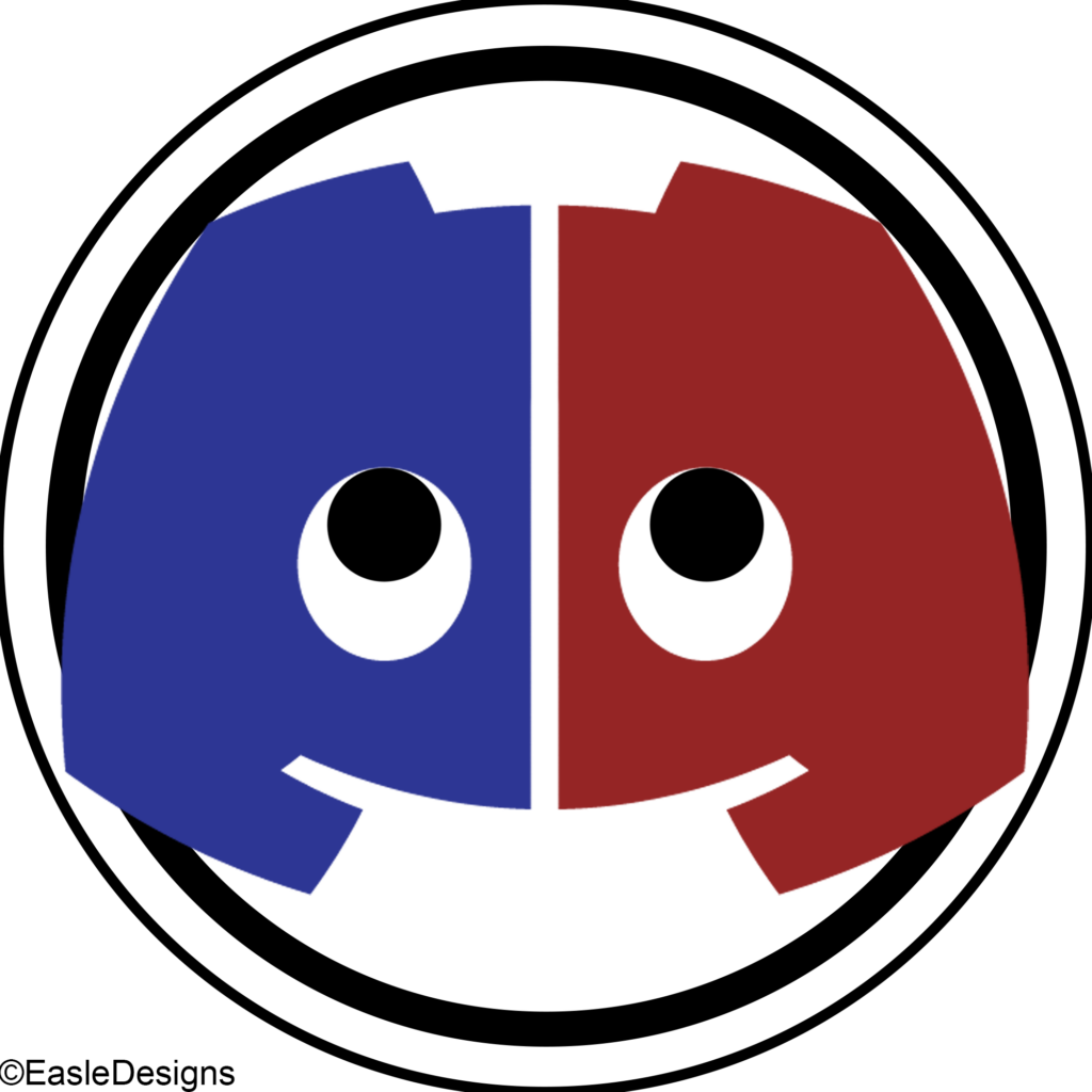
Discon (OG)
This is the first Discon logo, featuring the Discord logo cut in half, coloured with my old colours, and looking up idk why (let’s ignore that EasleDesigns thing ok, it was just for fun)
Discon (2023, blurpified)
This is the last Discon logo. The one here is blurpified and the OG was Red. People say it looks like it is on c*ke, but I tried making it raise an eyebrow or smth.
I have some other logos that I didn’t showcase, like the other Andrecode logos and some made by CGCristi cuz why not (search him up on Google, it is the first few pages, has own website) (+ some other logos)
Andrecode 1 (from the Blue-Red era)
Andrecode 1 (from the Blue-Red era)
Andrecode 1 (from the Blue-Red era)
First Andrecode logo, horrible, not centered, text to small, CODE is illegible.
Andrecode 2 (from the Blue-Red era)
Andrecode 2 (from the Blue-Red era)
Andrecode 2 (from the Blue-Red era)
Second Andrecode logo, even worse, has wingdings which I don’t remember, worse font ugh
Project AC (PS)
Project AC (PS)
Project AC (PS)
Andrecon but Dual-Shock 4
Project AC (X)
Project AC (X)
Project AC (X)
Andrecon but XBOX Controller
Andrecon Blue (By CG)
Made by CGCristi.
Andrecode by CG
Made by CGCristi but Andrecode
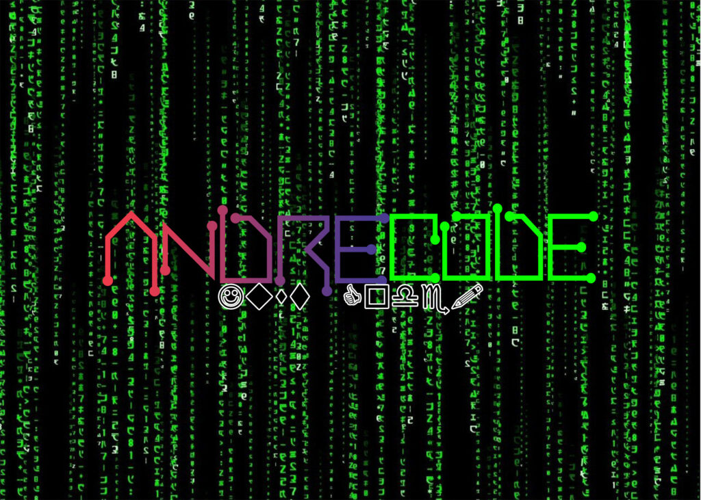
Andrecode Orange
Made in 2023, Andrecode but the best logo, having the main colours. Best
Simple Andrecon 2024
The new version of Simple Andrecon, specifically made for my Minecraft skin.
Well, that was all, but there is a thing I wanna mention.
The change
Did you notice that in The “new” era, I’ve changed my colour scheme from blue & red to blue & orange? Well, yea! After I made Simple Andrecon 2023, I changed the red to an orange for two reasons:
I was sick of seeing red and blue everywhere, I started hating my logos
I saw the colour combo looking really fine.
Yep. Byee!
Which logos do you think looks the best (with and except the more recent ones) and which logos do you think are the worst (maybe except Andrecode 1 and 2 cuz they were born to fail). Tell me ion the comments!
But I’m not an Artist. Maybe an artist with a small a.
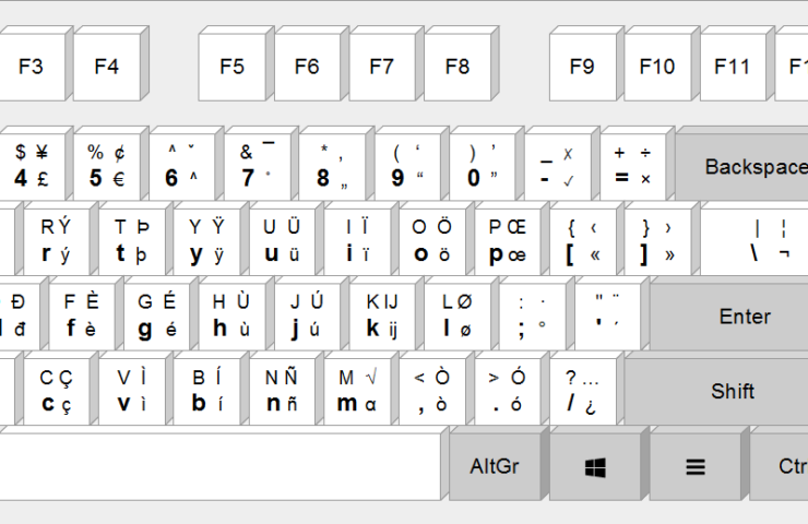
EurKEY is a multilingual keyboard layout which is intended for Europeans, programmers and translators and was developed by Steffen Brüntjen and published under the GPL free software license. It is available for common desktop operating systems such as Windows, Mac OS X and Linux. (yes it was taken from Wikipedia)
Note: You can type superscript and subscript with this, but for me (I use 3s) I have to use altGr+6 (for super script) and altGr+shift+6 (for subscript) instead of altGr+M and altGr+shift+M as it is shown in the pdf (plus you have to use normal parenthesis instead of square parenthesis and brackets)
Conclusion
I personally think that this is a must if you are obsessed with symbols, or you have your mobile keyboard so customized you want your pc’s too (#relatable)
It’s clear that Microsoft has made many mistakes in the company’s lifetime, from killing anything that they buy to the creation of Windows 8.
What mistakes did they do?
Well first, there is Windows 8, with its metro UI that confused everybody and got a reputation so bad Windows 8.1 was recognized as the same problem, even if they fixed the start menu. The problem was that tablets were all the rage back then. Microsoft saw money out of that trend and they made the start menu be more useful on a tablet but failed at being good on a computer.
A program I should mention is Clippy. We all know about him being the assistant we never needed. Same thing as Windows 8. They thought it would be a great idea to make something that was trending, and turned out to be bad. Clippy tried to help, but he was useless and annoying. Let’s just say even a spyware (if you know you know) would do a better job.
Clippy
Skype was the most popular video chat app in the 2000’s. It was bought by Microsoft and got worse and worse over time. Exact same thing: they buy/make, they end up making the thing worse.
Here’s the part where you help!
I want all of you as a community to help Microsoft fix their mistakes, and even make Windows 12 (when it will come out) be better and have less bloatware. We will make Microsoft better again, like how it was when Windows 7 was still around!
I want all of you to post everywhere ,on every social media you have, something you would want to change about the company, and then ,maybe, link to this blog post.